Abstraction
Abstract photography focus's on shape, form, colour, pattern and texture. The viewer is often unable to see the whole object with the focus on only a small part of it. As a viewer of an abstract shot you may only know the essence of the abstraction or understand it by what is implied. Normally the object or image will not be a literal view of the subject.
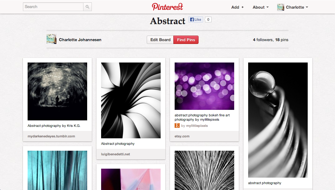
I have made my own pinterest board which has photos of lots of different ways people have approached the theme. I also used it for inspiration in taking my own photos.
I have made my own pinterest board which has photos of lots of different ways people have approached the theme. I also used it for inspiration in taking my own photos.
|
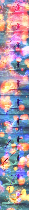
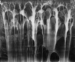
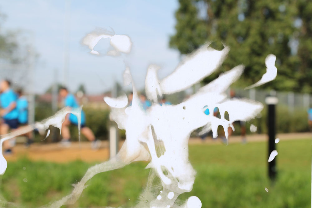
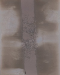
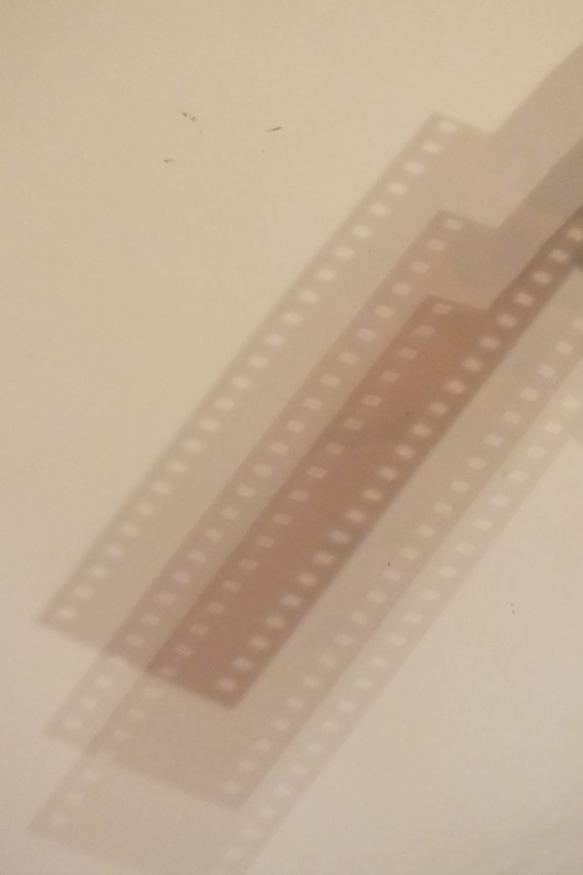
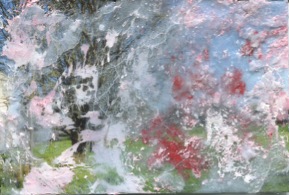
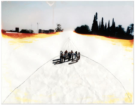
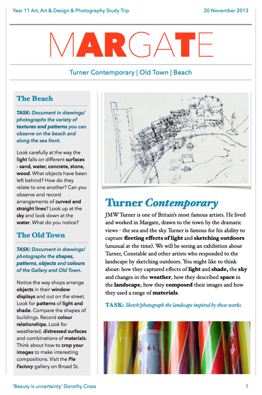
The Formal ElementsThis image is by the photographer Jennifer West.
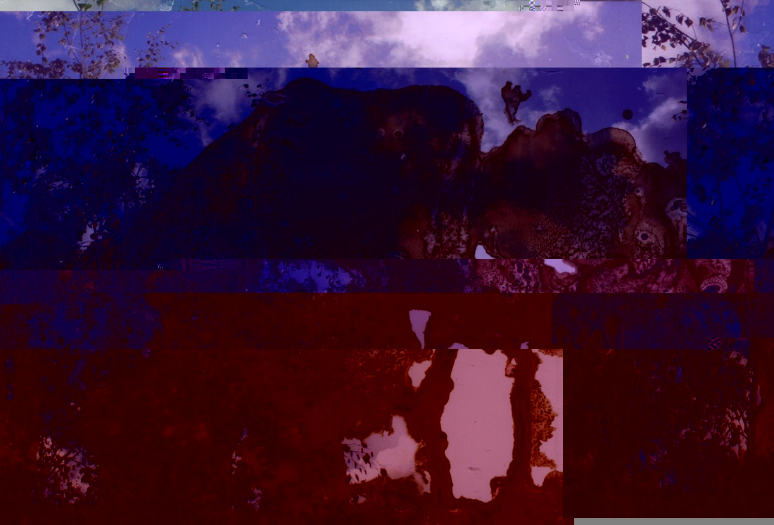
She is a contemporary American artist and uses standard every-day products to process her films. Some of which are, coal-tar dye, whiskey and urine. Focus: The actual image is in focus but the chemicals that have been experimented with on top of the picture the subject becomes unclear. Light: I can see that the picture has been taken during the daytime because I can faintly see light reflections on the waves from the sun. The various things the photographer has used on the image make it very bright and vibrant. Line & Shape: There are no strong lines and the only shape is the figure who is surfing. There are circular shapes caused by the chemicals but most of them are large patches. Repetition: The whole picture is like a film strip so the main image has been repeated but just changes ever so slightly in each frame. Texture: The waves are breaking around the figure which is quite rough. Value/Tone: The back image is made up of 2 quite dim colours; black and blue. This makes the colour patches look even brighter and they stand out more. |
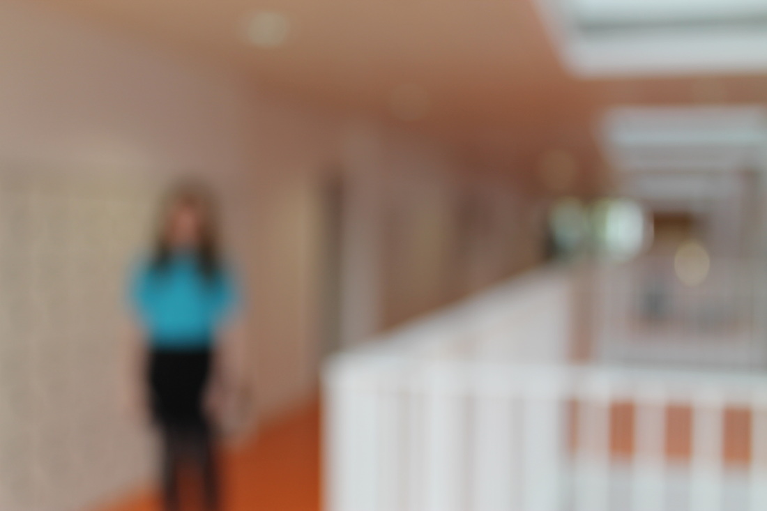
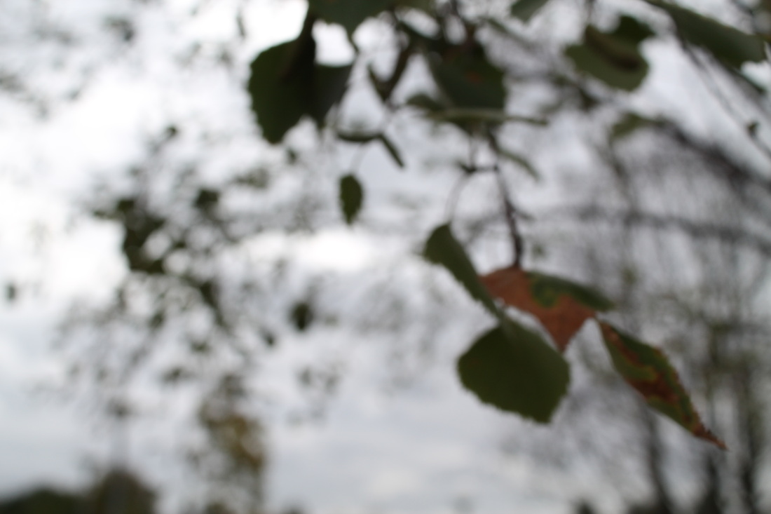
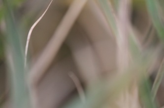
Photo set #1For my first set of images I decided to focus on the formal element: focus.
What I like about this is that you can vaguely see what the subject of the image is but there is still an essence of mystery about it. I got inspiration from the photographer Uta Barth who makes lots of images out of focus. I think they worked quite well for a first attempt. My favourite is the first image in this set because the colours are interesting and there is lots of content.
|
Chemigrams
|
Pierre CordierPierre Cordier is a Belgian artist who invented the chemigram technique. The inspiration for this technique came form when Cordier was doing military service in Germany 1956, he wrote a dedication to a girl in nail polish on a piece of light sensitive paper. Chemigram's, "combine the physics of painting (varnish, oil, wax) and the chemistry of photography (photosensitive emulsion, developer, and fixer), without the use of a camera or enlarger, and in full light". His advice for new chemigrammers is, "practice, practice, practice."
|
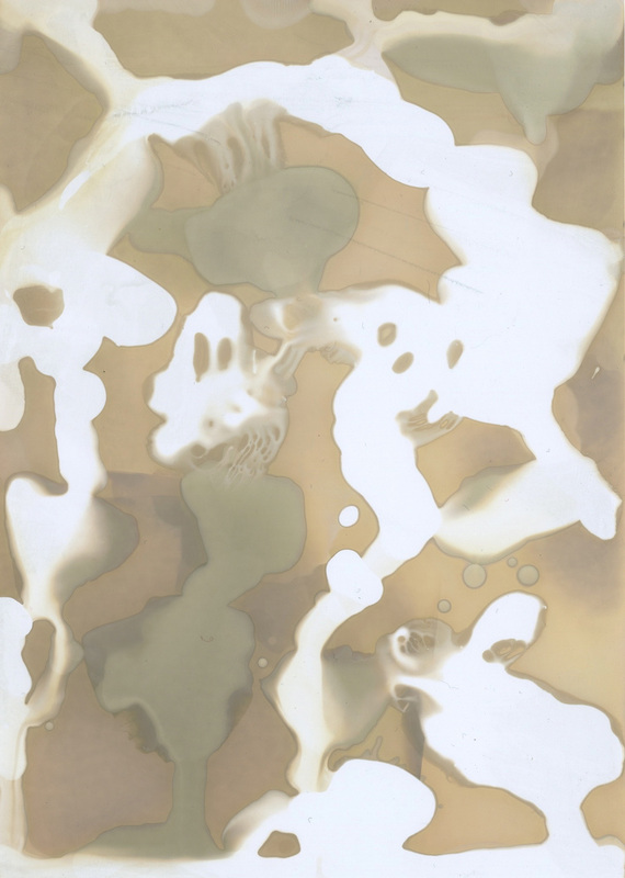
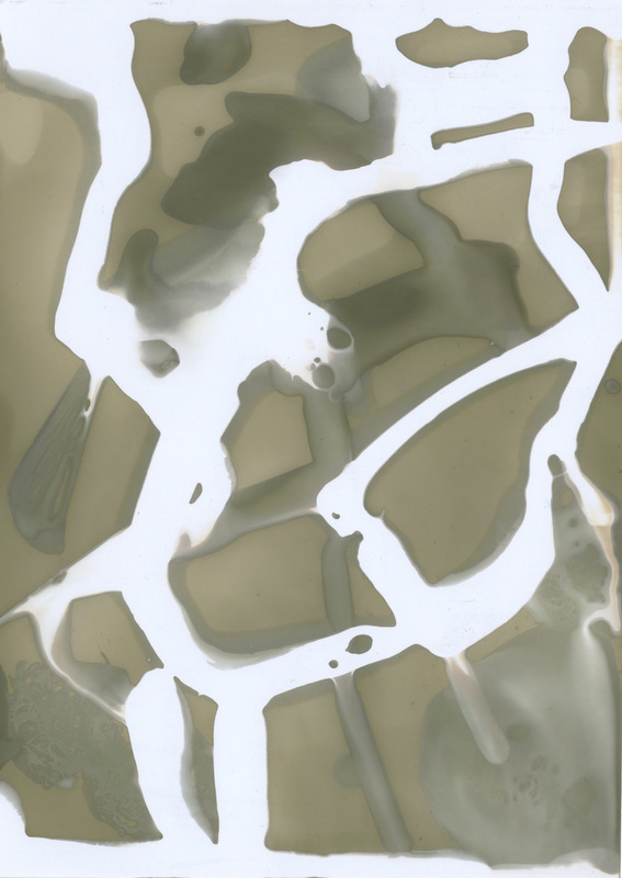
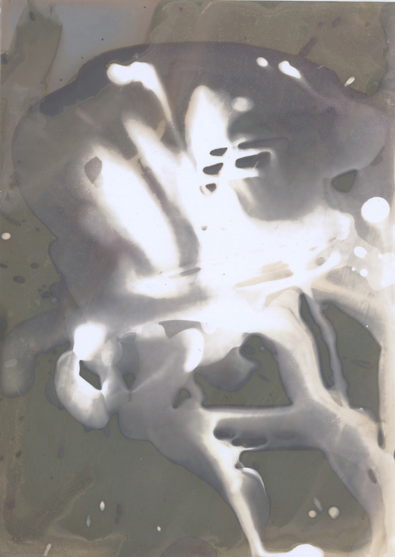
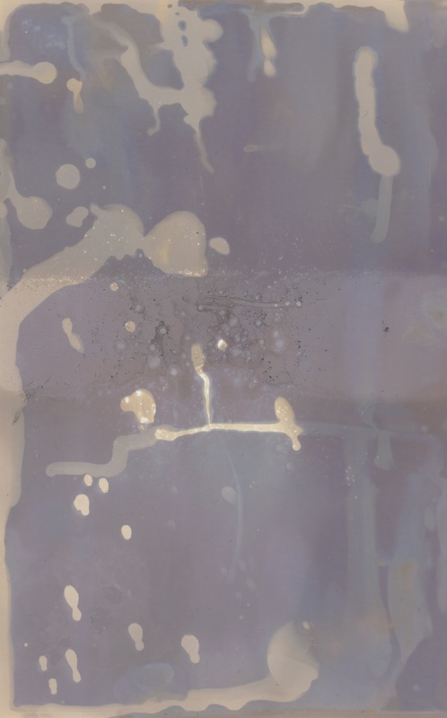
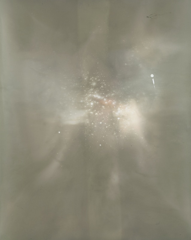
Chemigrams experiment #1
|
|
These are the chemigrams I created using the stop, fix and develop chemicals. I put the straight on to photographic paper and then exposed to the sunlight for a about 5 minutes. The chemigrams are ordered in the order in which I made them. You can see that as I made more and more I began to understand what each of the chemicals looked like on the paper. My favourites are the two on the far right. I like these ones because they have a sense of depth to them because I put the darkest chemical on the bottom and then the lighter ones on top. I also like the purple tones in the images.
|
Photoshop experiment
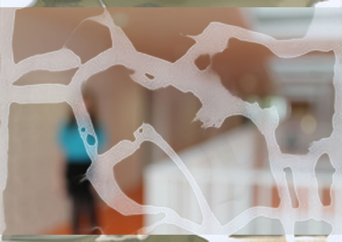
I have used photoshop to put my chemigrams on top of the pictures I took previously. The effect was quite interesting and abstract but I don't really like the way it looks so I'm not going to use it for my final piece.
Chemigram experiment #2
This was another experiment I did whilst making the chemigrams. For this I put a tray of water by the window and put a piece of photographic paper in the water. Very quickly after putting the paper in the water I drop a few blobs of black ink into the water. I hoped that the ink would block the sunlight from exposing the paper and leave a cool pattern. They didn't turn out the way I expected but it was quite an interesting experiment.
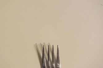
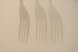
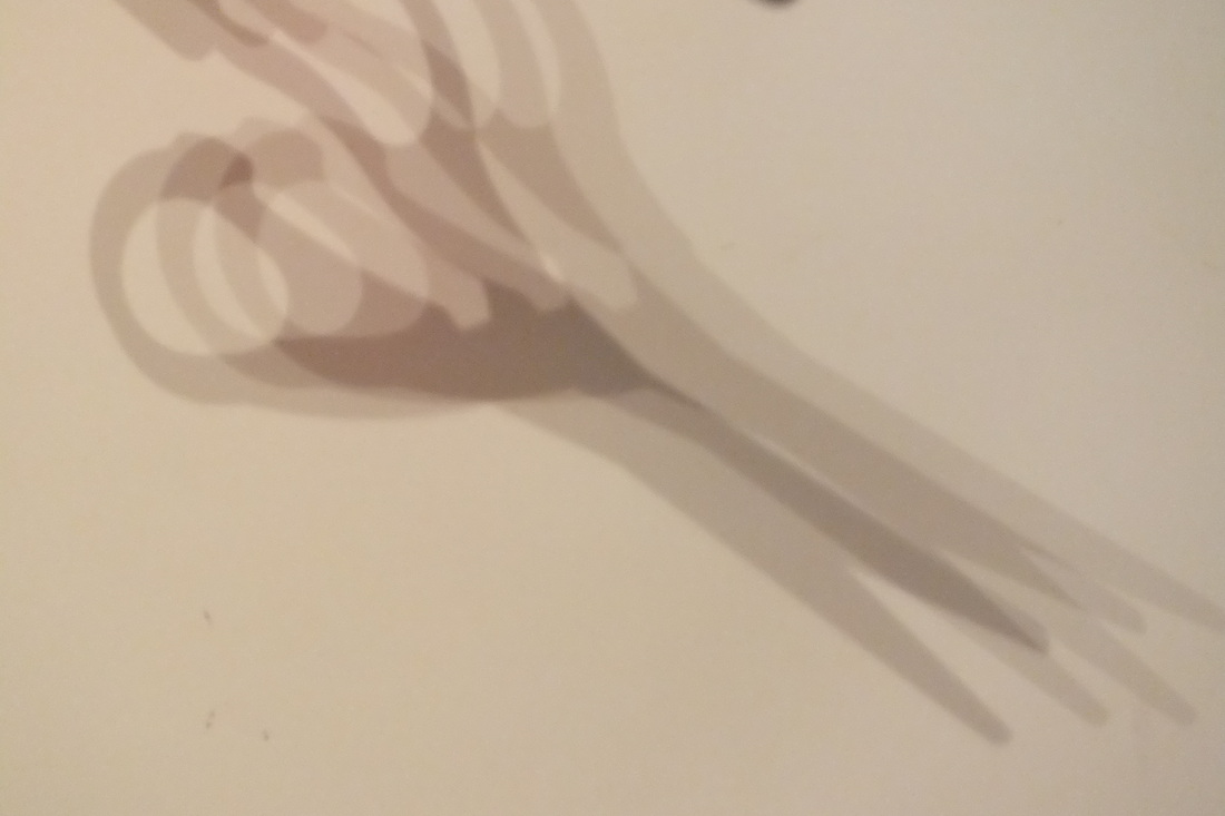
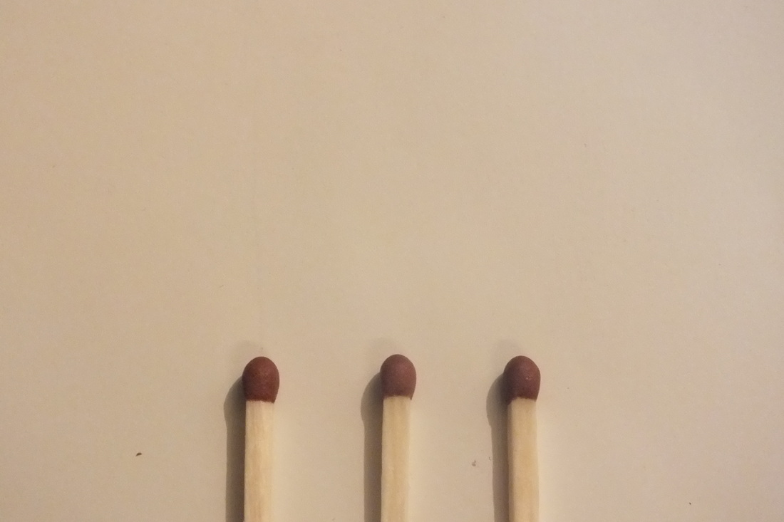
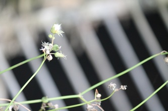
Photo set #2
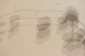
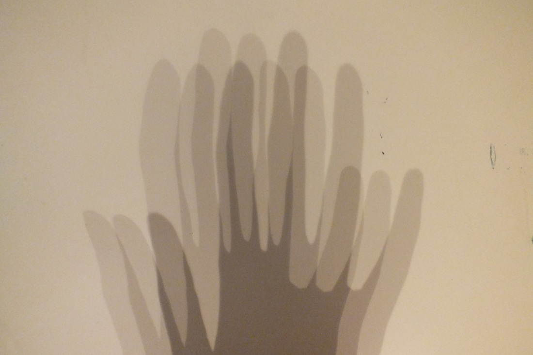
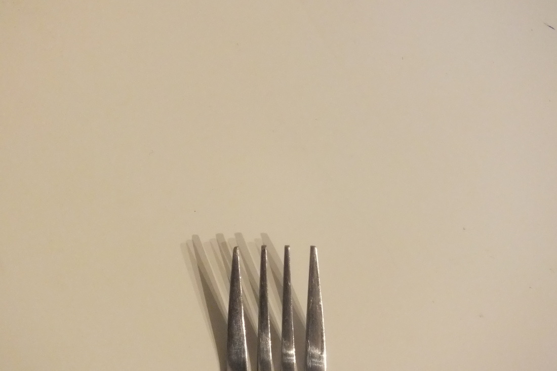
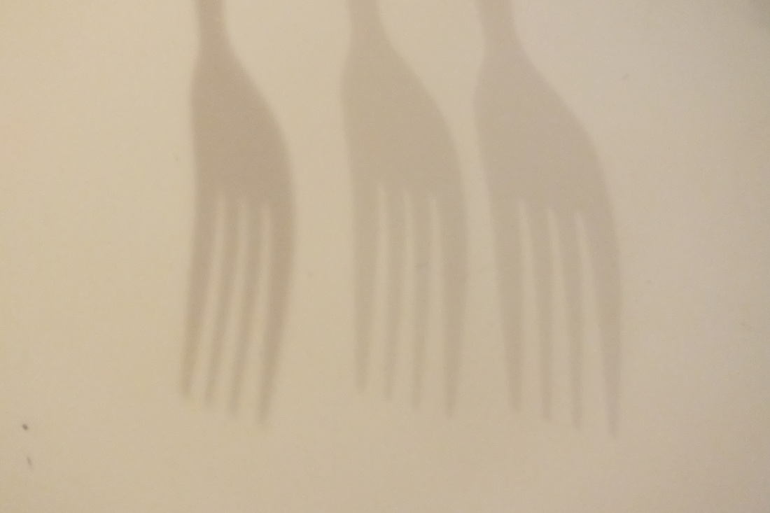
For these photos I set out to make some minimalist images which showed only the most important section of the objects. For example in the fork picture the prongs are what make a fork a fork, so I just took a photo of that section. The same with the matches. Whilst making these pictures I noticed that the shadows created by the objects were quite unusual because they were lit from three different points in my room. So I decided to experiment with a few different objects. I have arranged the ones below as diptychs because they are the same object just photographed in a different way.
|
|

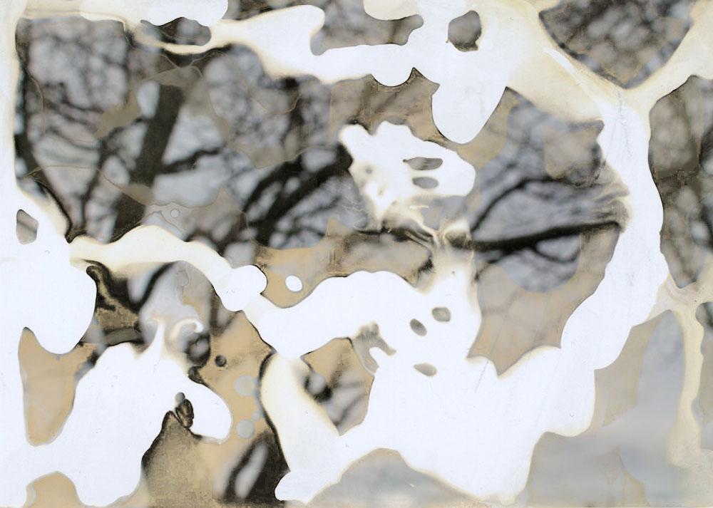
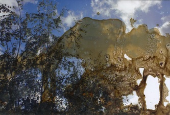
Wax experiment
For the images below I took some mundane pictures of trees which I then printed off on photographic paper. I put hot wax on two of them to see how it would distort the image and what it would look like. The first image is just wax, I liked it when the wax was still hot because you could see the image underneath but it was foggy and distorted from the liquid. The second image I used the wax again but this time I put some blobs of paint on it, I expected the paint to merge with the wax and make a nice marbled pattern but the wax tried too quickly for the liquids the mix. The third image is the same as the first one except this time I put wood varnish on the paper.
|
|
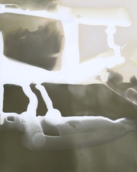
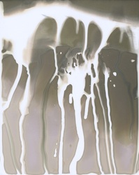
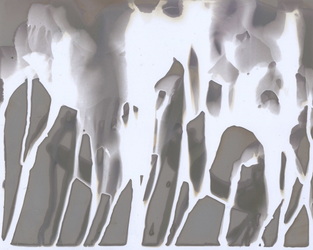
Bleaching experiment
These photos are some old ones that I had at home which I decided to use for my first bleaching experiment. I applied the bleach generously using a paintbrush. The bleach instantly started to effect the image and made it a red colour and the longer I left it on, the more colour came away from the picture until sections were left completely colourless. I decided to do this because I came across Curtis Mann's bleached photos whilst looking for inspiration. I thought the bleach gave the image a sense of depth and also It is interesting how you can completely remove sections of an image. The images didn't work as well as I hoped they would because I couldn't get the hang of applying the bleach just to certain areas so it didn't look the way I had imagined. Some of the images went well, my two favourites are those in the middle column below. To improve the pictures I should have used clear varnish to protect the areas I didn't want to be effected by the bleach rather than putting it on randomly.
|
|
|
|
|
|
Photographer research:
Uta BarthUta Barth is a contemporary photographer whose practice is about exploring light and space. Lots of her photos are out of focus which is one kind of abstraction I am interested in.
|
|
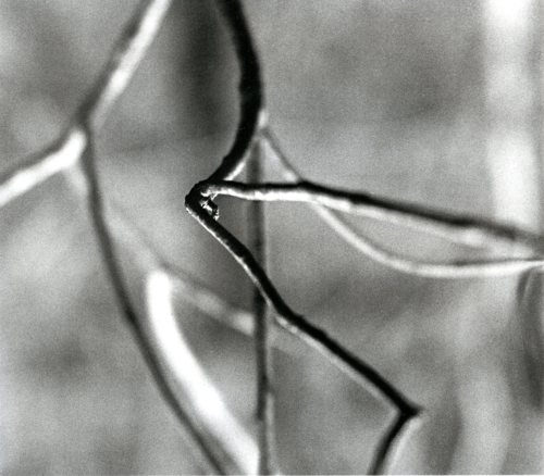
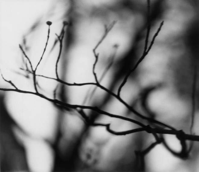
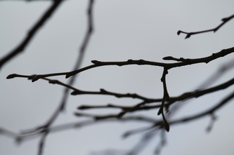
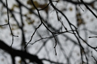
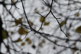
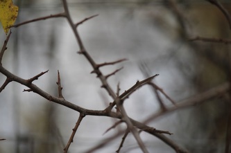
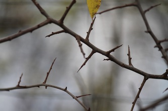
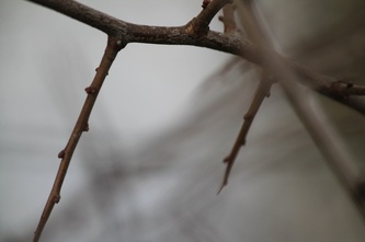
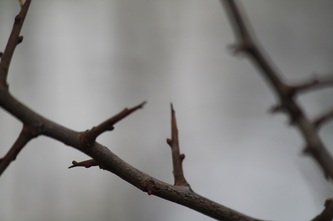
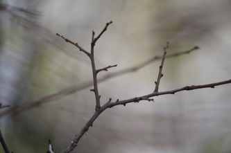
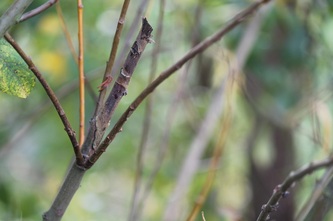
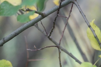
Ralph Eugene MeatyardThe set of photos I am focusing on by Ralph Eugene Meatyard are the ones entitled 'Zen Twigs'. These images were influenced by Zen Buddhism. He created these images by using a telephoto lens and a very shallow depth of field. This was so that the singular twig would stand out from the rest.
|
|
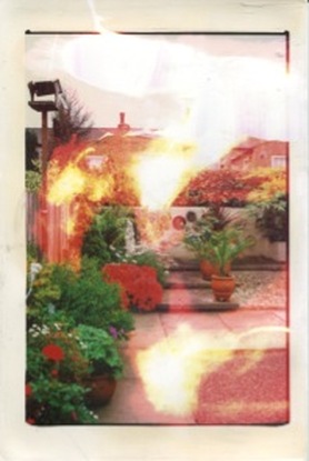
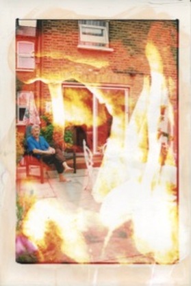
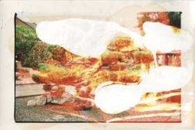
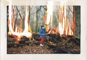
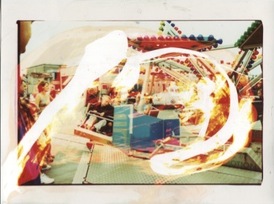
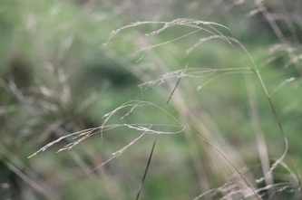
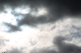
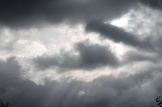
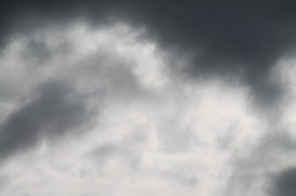
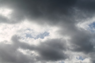
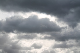
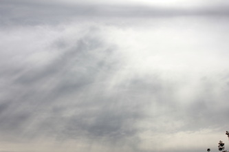
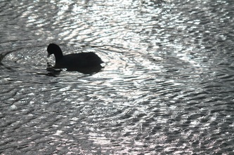
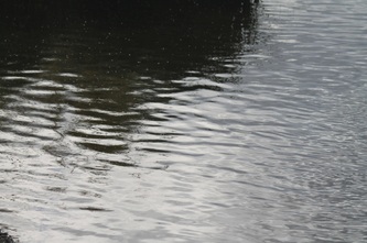
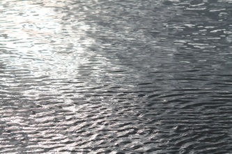
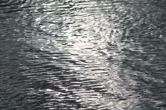
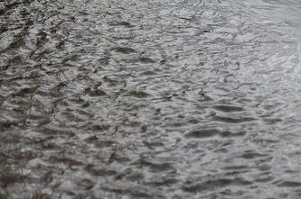
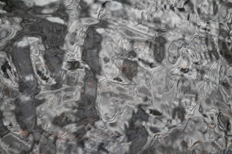
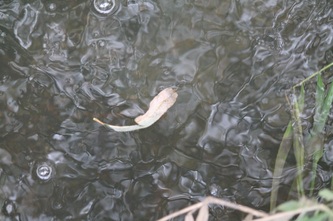
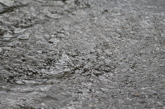
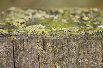
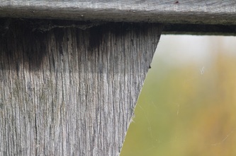
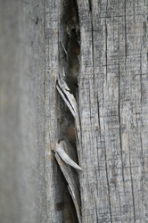
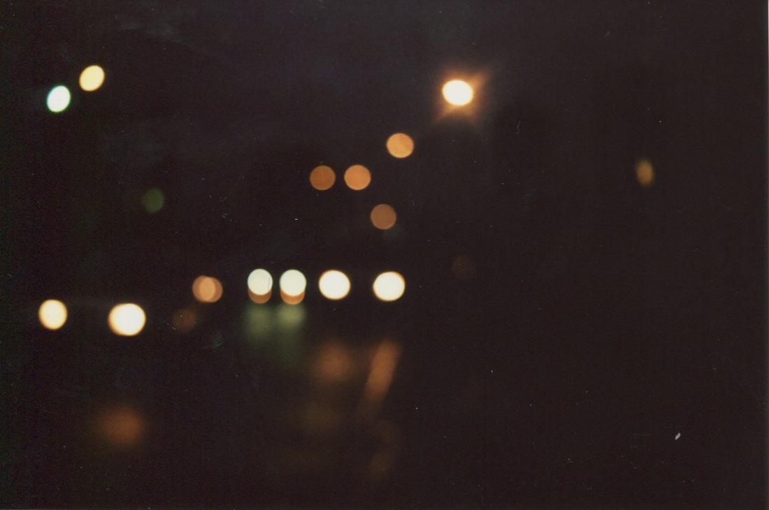
Sutcliffe Park trip - November 2013
On this trip I based my photos on three of the photographic elements; focus, light and texture. I did this because they are the ones that I like most and I thought it would be interesting to experiment with creating pictures that follow these themes.
|
|
|
|
|
|
|
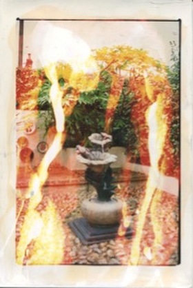
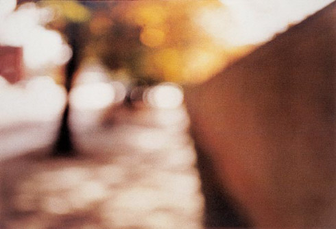
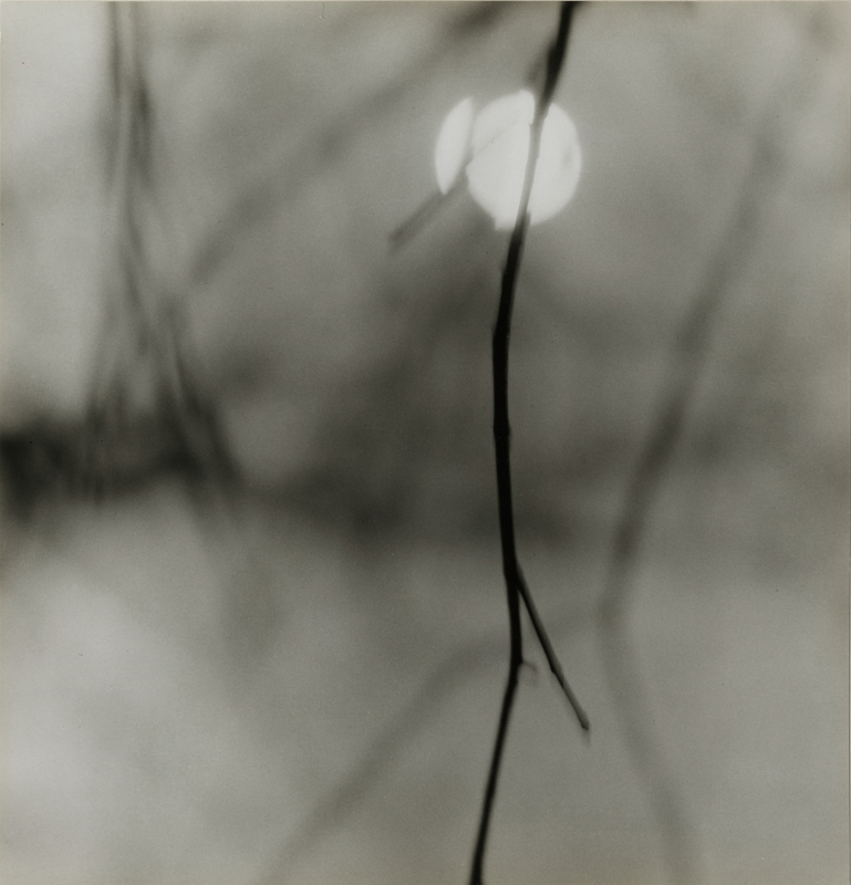
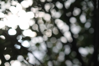
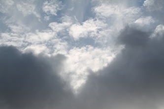
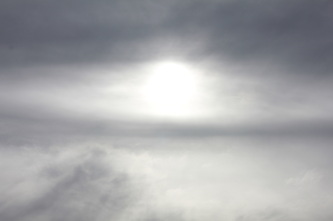
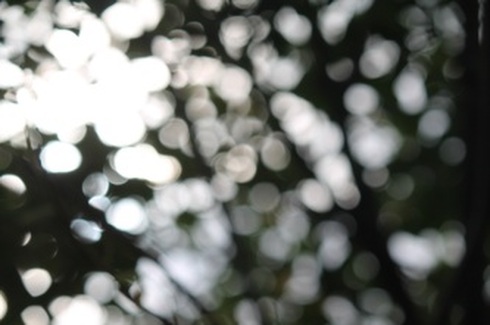
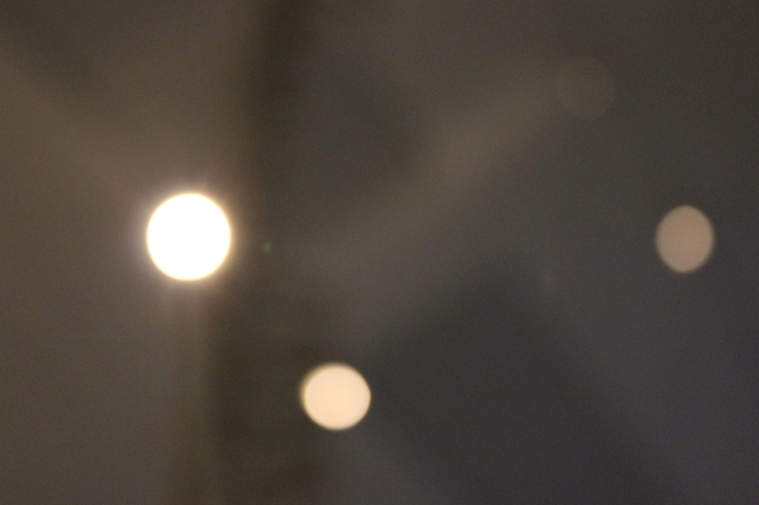
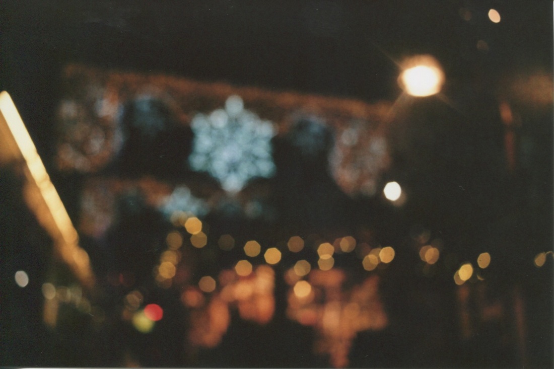
This is my favourite of the images I made because the way the light has been obscured and the circles of light make the images look very abstract. This image was inspired by Uta Barth's images and the bokeh effect. The way that there are patches of really bright light and patches of not so bright light gives the image a sense of depth which I like. I want to take more images in this style and possibly use them for my final piece. |
|
|
|
|
|


| margate_trip_worksheet_-_nov_2013.pdf |
|
|
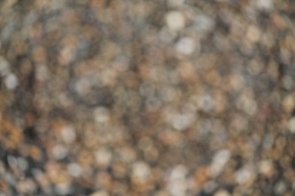
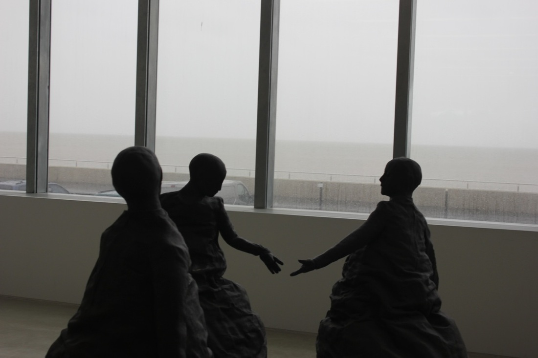
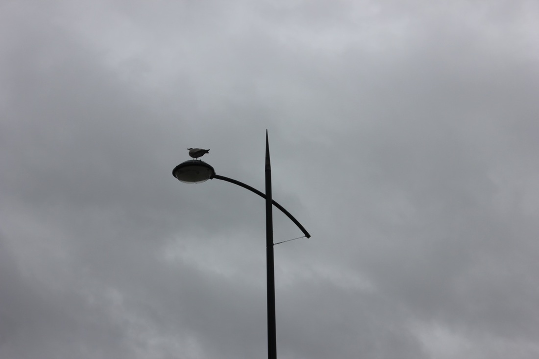
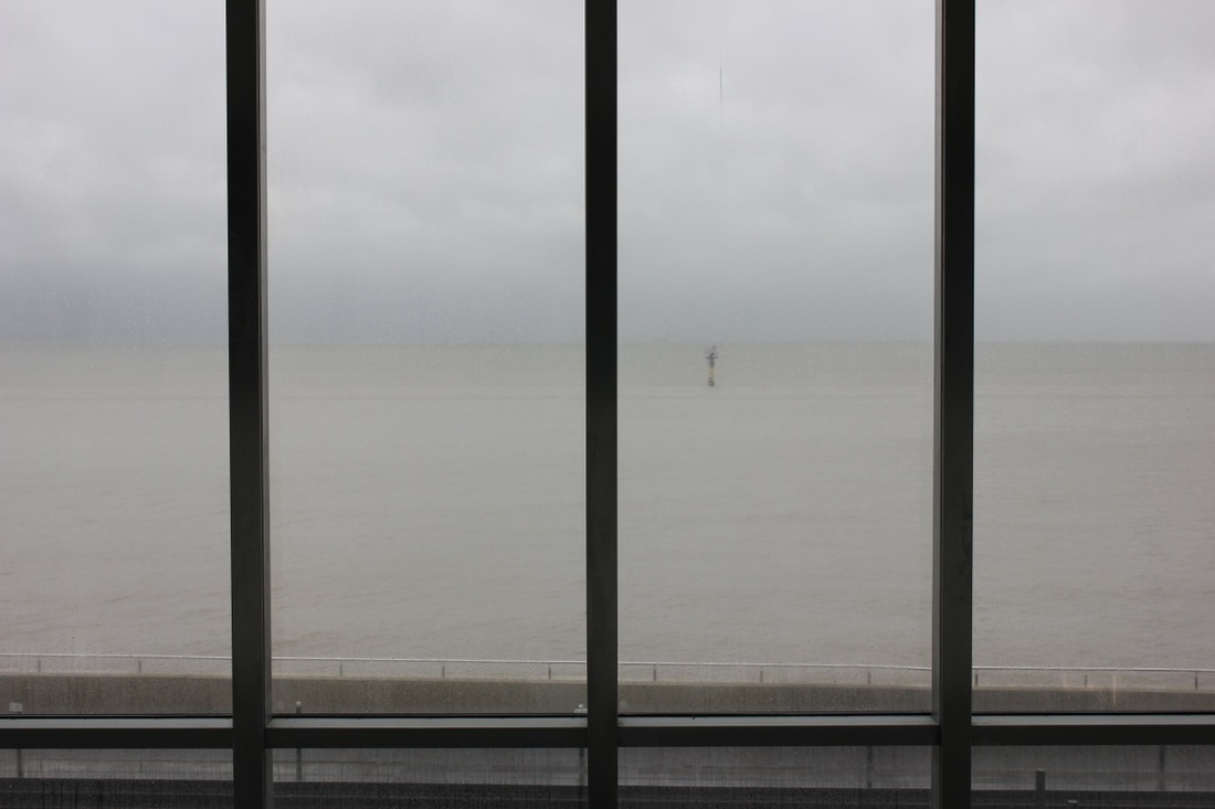
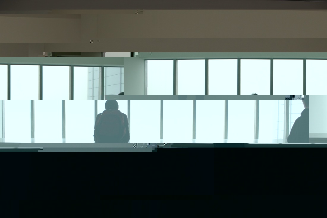
I took these images in or just outside of the Turner Contemporary gallery. For these pictures I concentrated on contrasting the subject from the background. It was a good day to do it as the weather was the typical grey english weather.
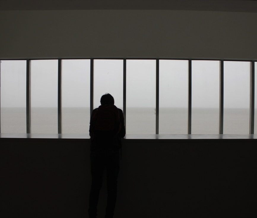
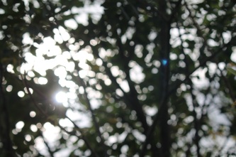
These pictures were taken inside the gallery in the Dorothy Cross exhibition. I made these images in the bokeh style.
GlitchingWhilst researching some other ways of making an abstract image I came across some images which had a glitch effect. I thought it would be quite interesting to experiment by making some of my own glitched images. So I found this video on youtube which taught me how to do it very simply in the 'Text Edit' software on the computer. I used some images that I have made during this abstraction project. I like the way that as I was making them I didn't know how they would turn out until I had so it was a surprise when I opened up the edited version. I think that the way some of the colours have completely changed are really interesting and pretty abstract.
|
|


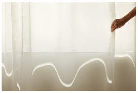
Display strategyI want to display my images like the photo on the right, I think the randomness of the size and arrangement links to the random way I created my images. I also think that the way the images are displayed resembles the pixel squares in my pictures.
|
|
Final piece
I printed of my glitched images in a variety of sizes and mounted them on card. The images work quite well as they are really abstract and visually interesting. The layout is also effective as it compliments the broken up nature of the images. I arranged them so that there are areas of bright colour all over so your eye isn't fixed to one position. I think it could have been improved by printing more of the glitched images and spread them out more like the layout I wanted to make because mine looks a bit too compact and grid-like. Another way to improve would have been to make the pictures different shapes as well as sizes. This would make the images even more abstract because rectangle is the expected shape of a photograph.
|
|
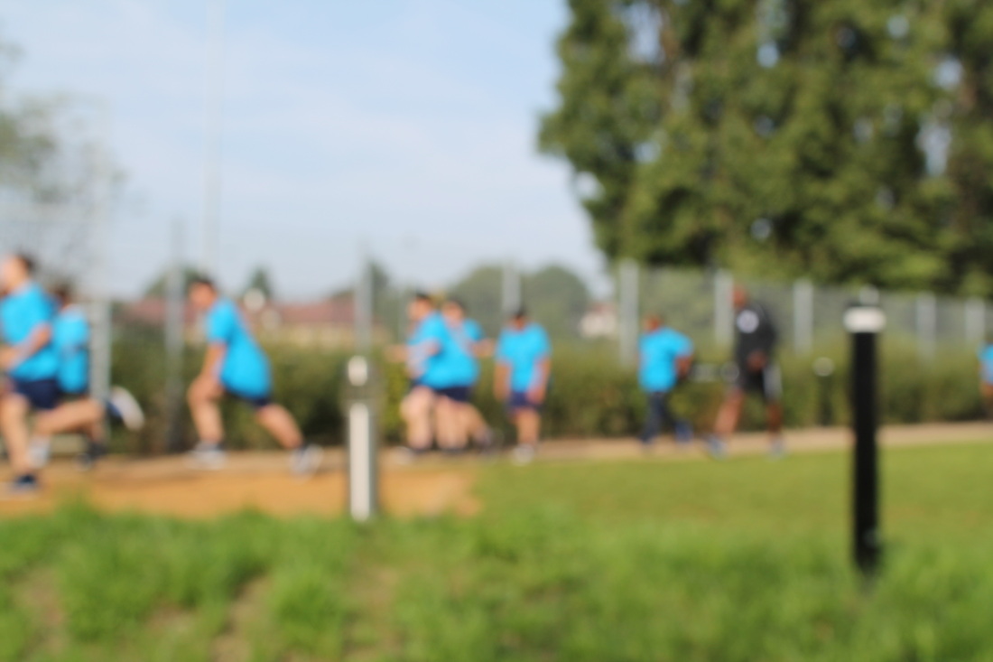
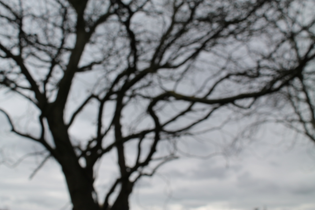
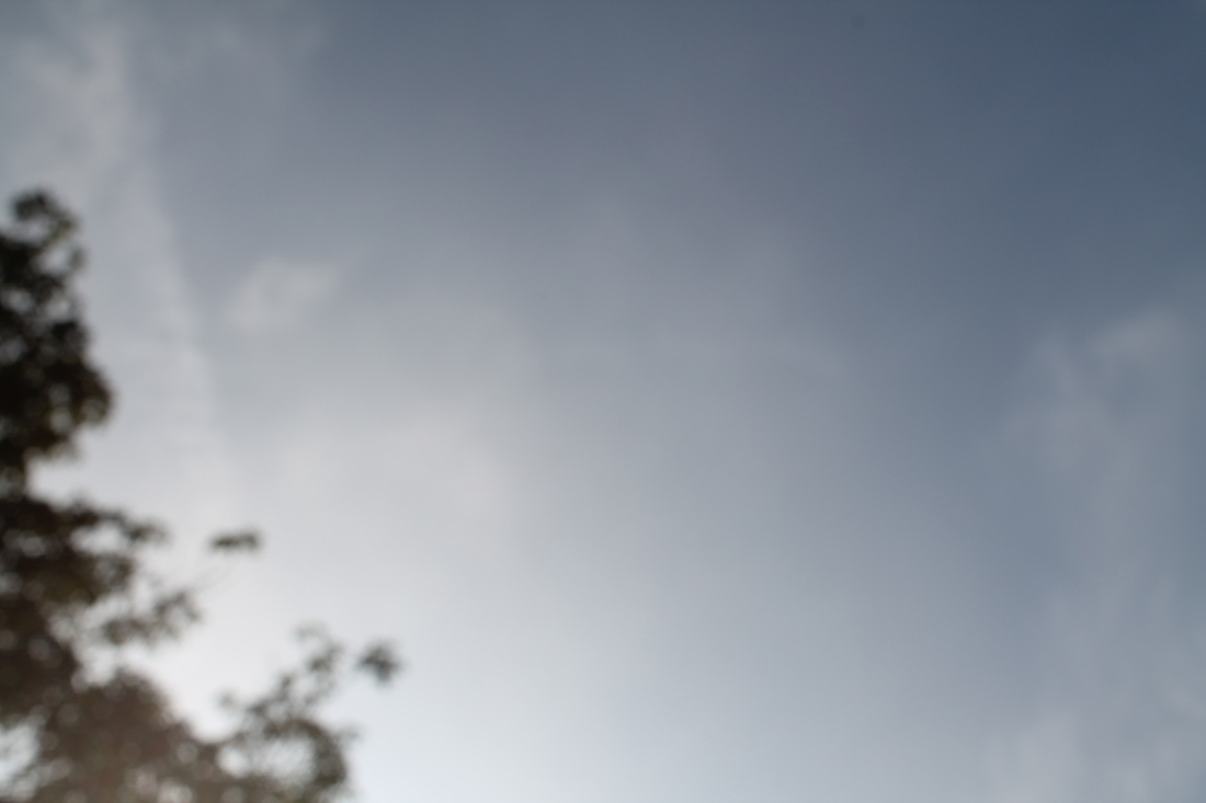
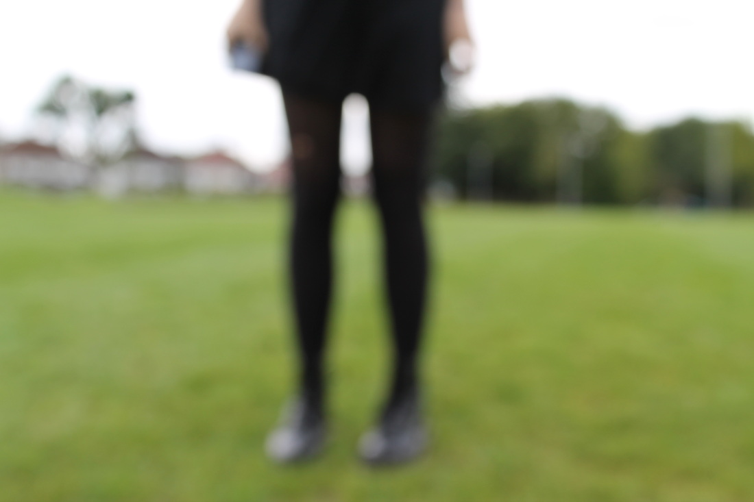
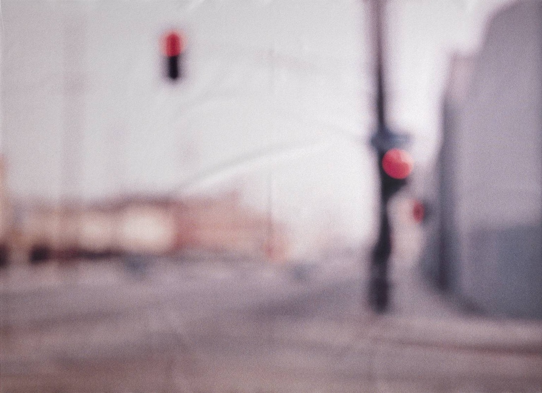
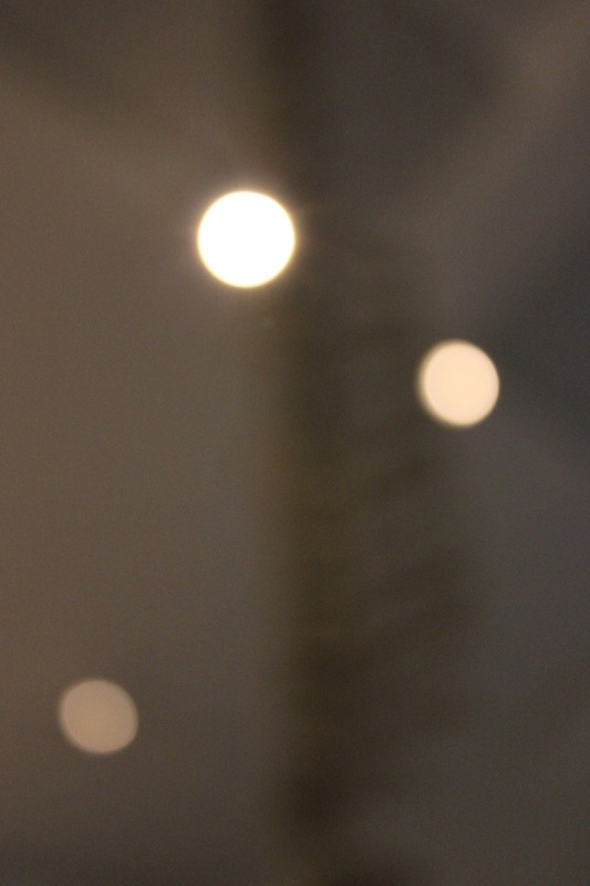
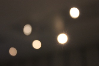
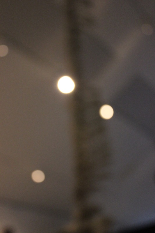
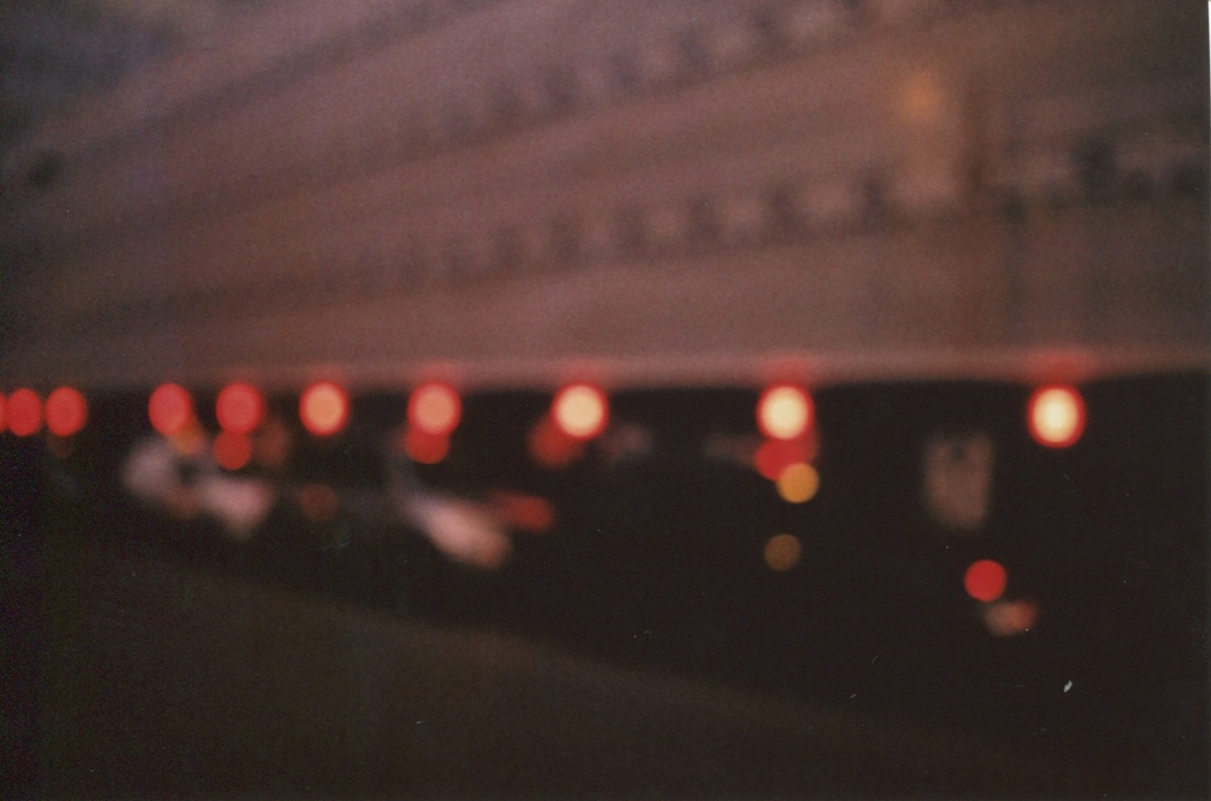
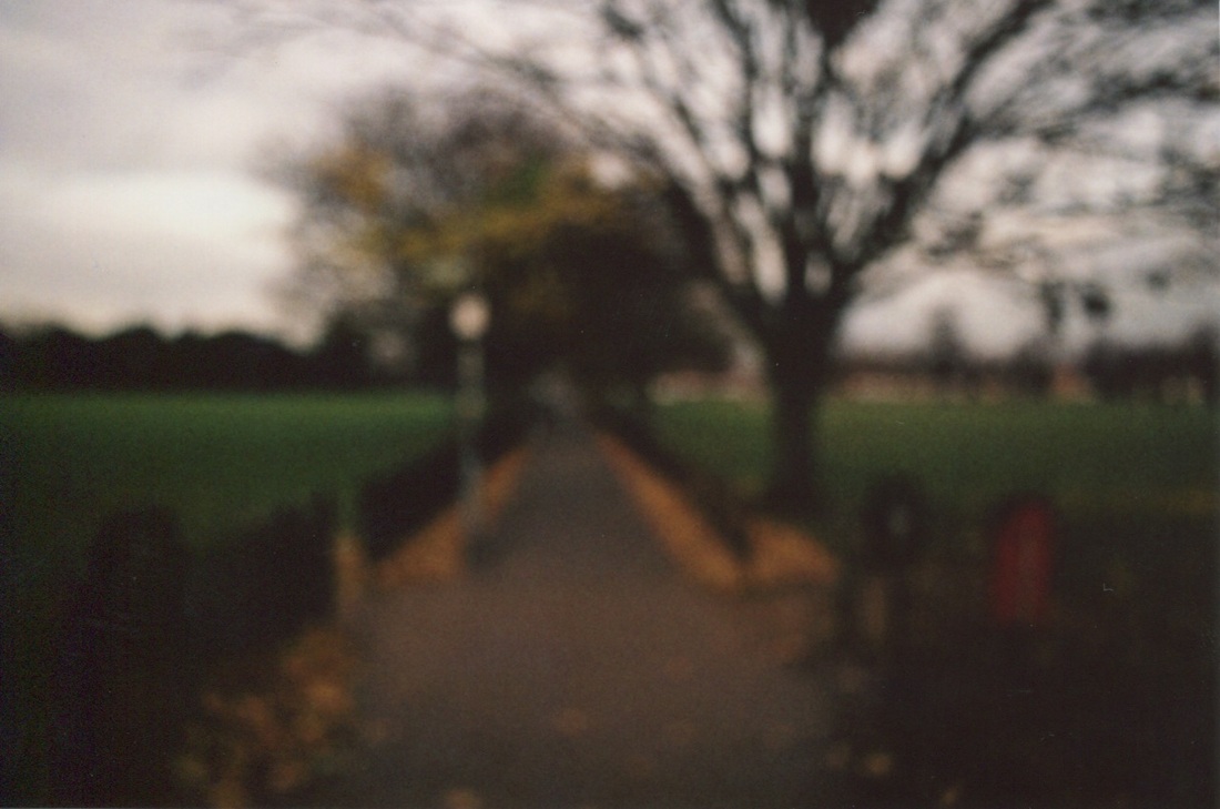
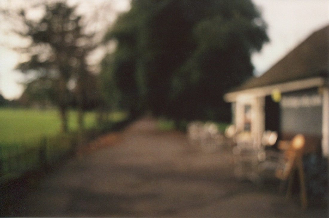
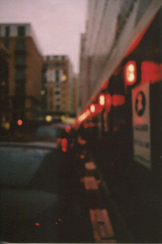
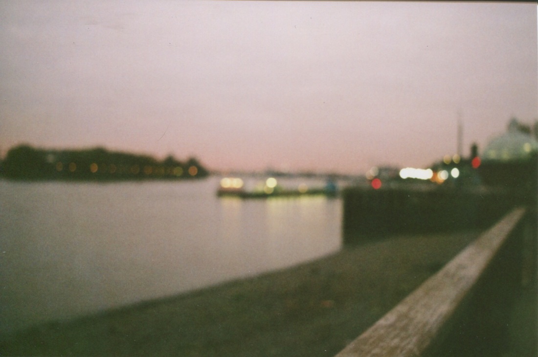
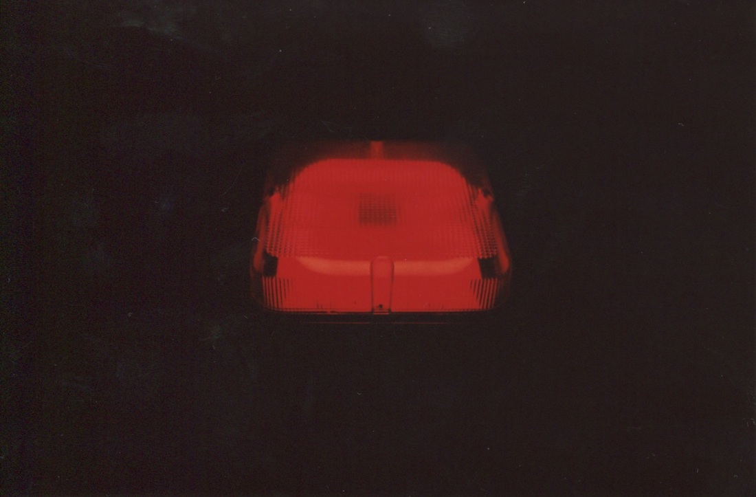
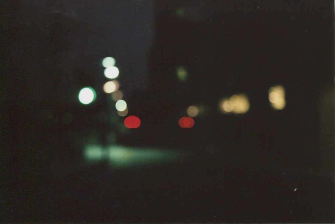
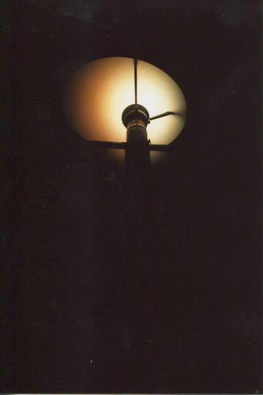
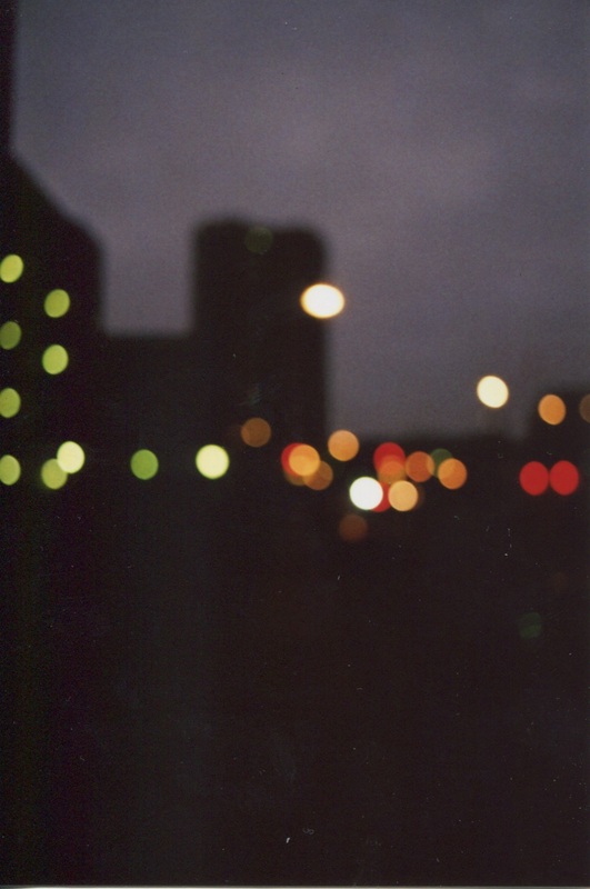
Out of FocusTaking inspiration from Uta Barth's out of focus images I have made a series of images using a 35mm camera. The subjects I focused on were lights which made a bokeh effect and everyday street scenes.
|
These are all the photos I took inspired by Uta Barth's

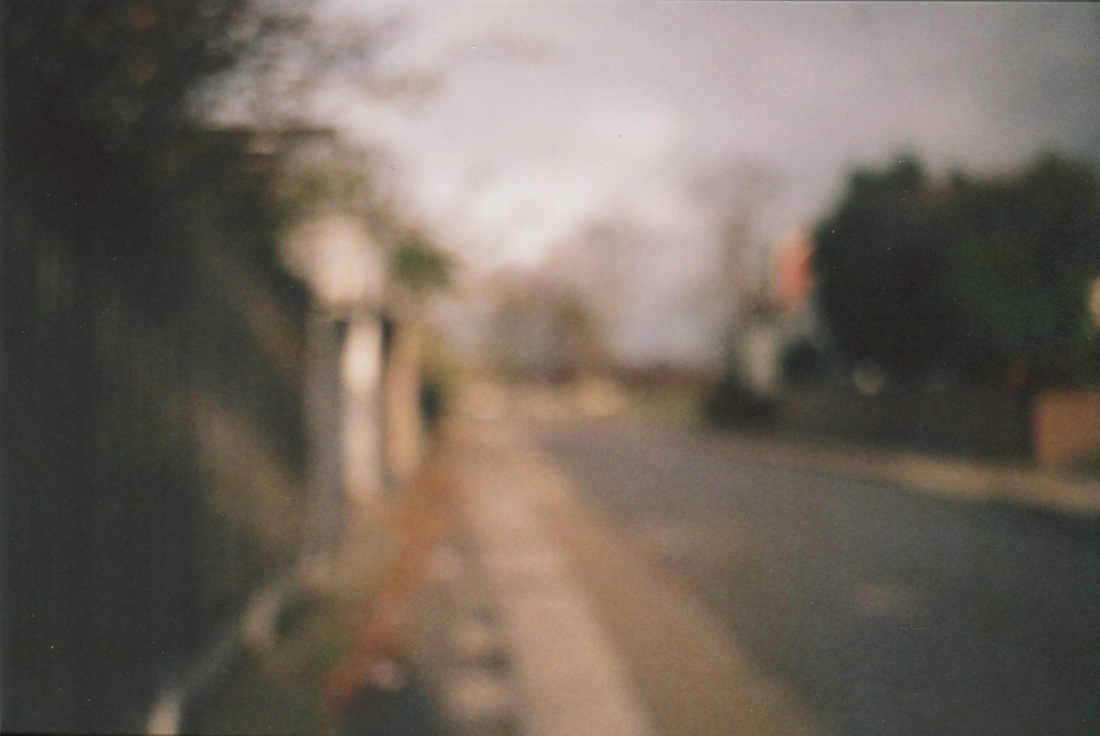


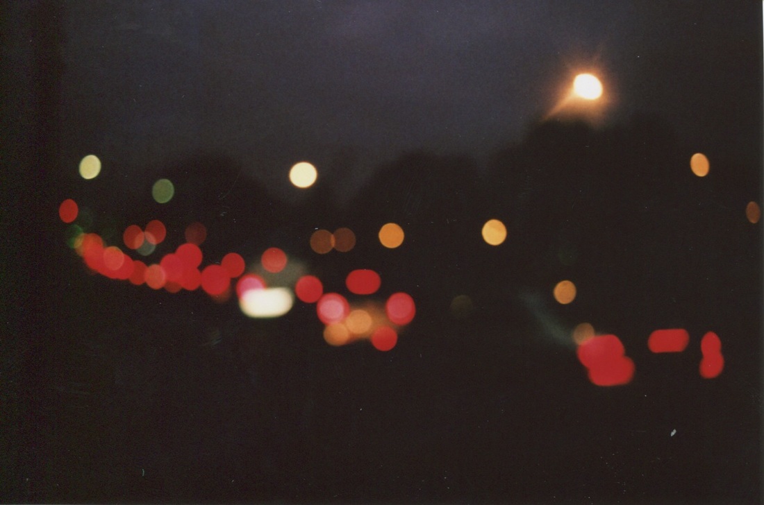
I am going to display the four images below in a grid.
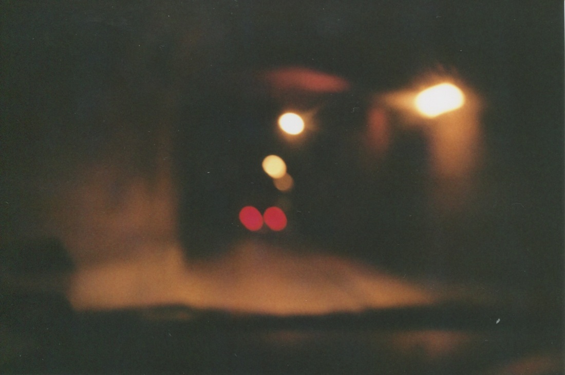


The images below will be printed in A4 and arranged together in a vertical strip.


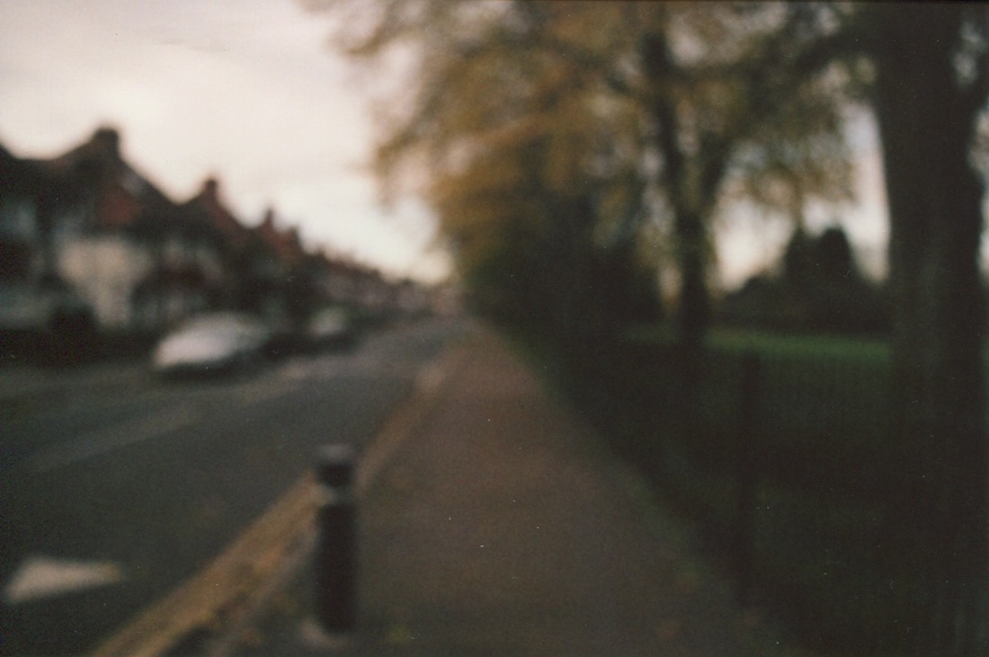
This image will be printed A3 and displayed by itself.
Final piece #2
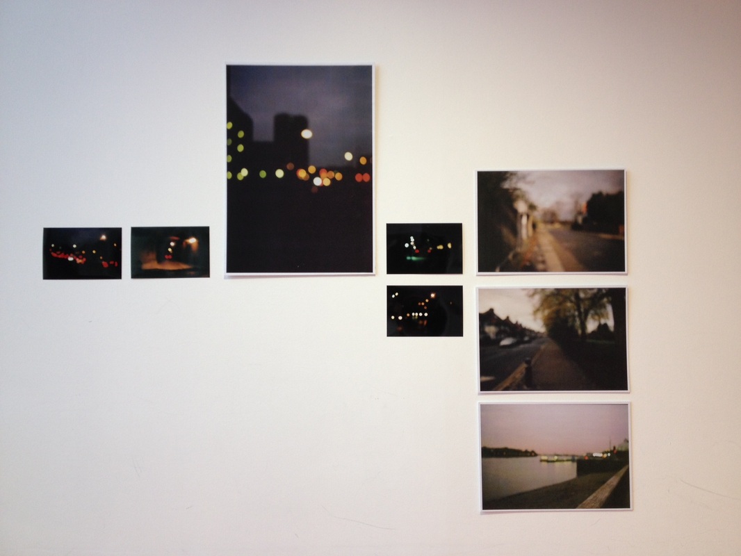
For this final piece I decided to use Uta Barth as my influence as I particularly liked the way in which she abstracted images using depth of field and shutter speed. I have displayed my pictures in the style of Wolfgang Tillmans to show the contrast between Uta Barth's soft edges and Tillmans hard, angular, regimented lines. I have used size to link my images so that the dramatic shots draw the attention of the viewer.
