Unit 2: The Externally Set Task
|
|
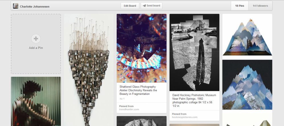
Click on the image below to view my pinterest board.
|
|
|
|
|
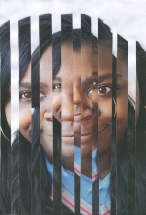
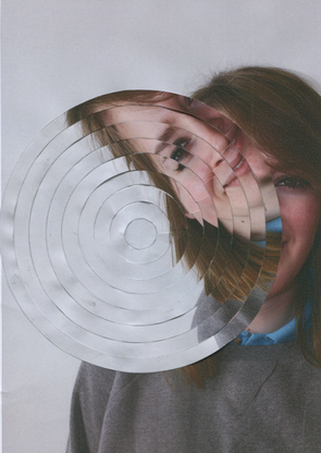
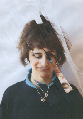
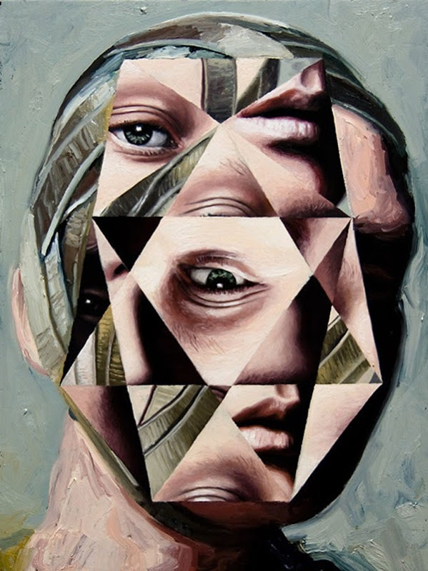
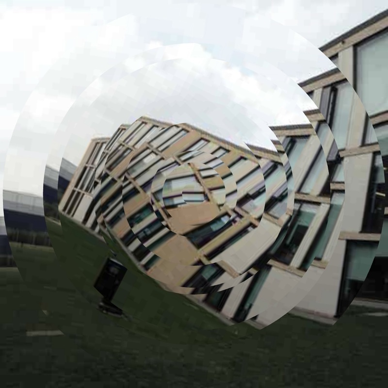
Above I have made some of my own distorted portraits using Jean Faucheur's techniques. I think they have worked well even though I made a mistake when making the circular one. I like the idea of taking a regular portrait and then fragmenting it by hand because it shows how easy it is to distort something very mundane into something that can be visually confusing. I am now going to make some more fragmented portraits but this time I will use my own methods to fragment the images.
|
|
|
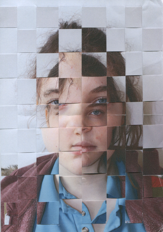
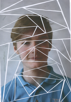
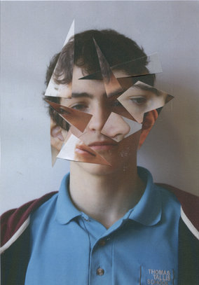
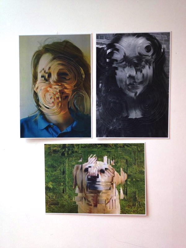
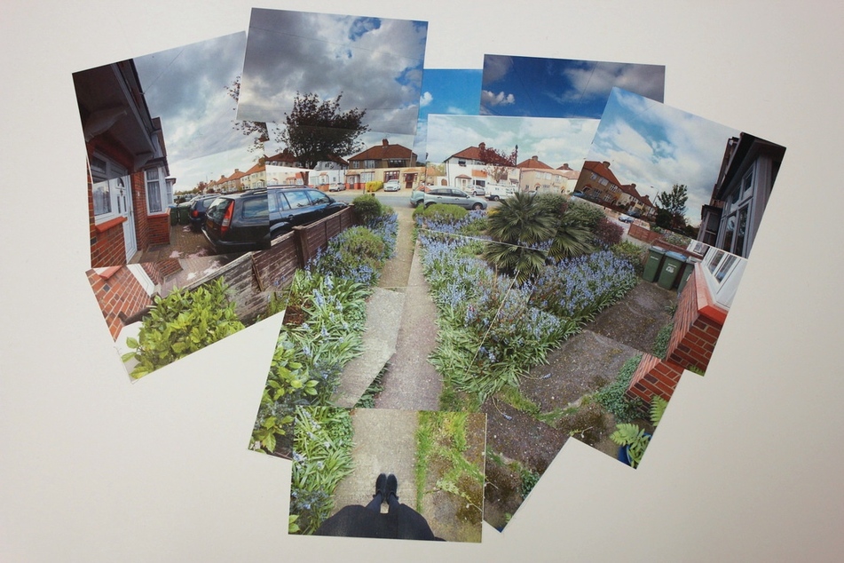
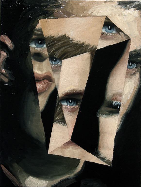
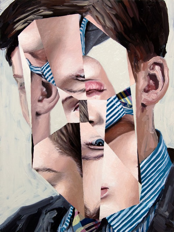
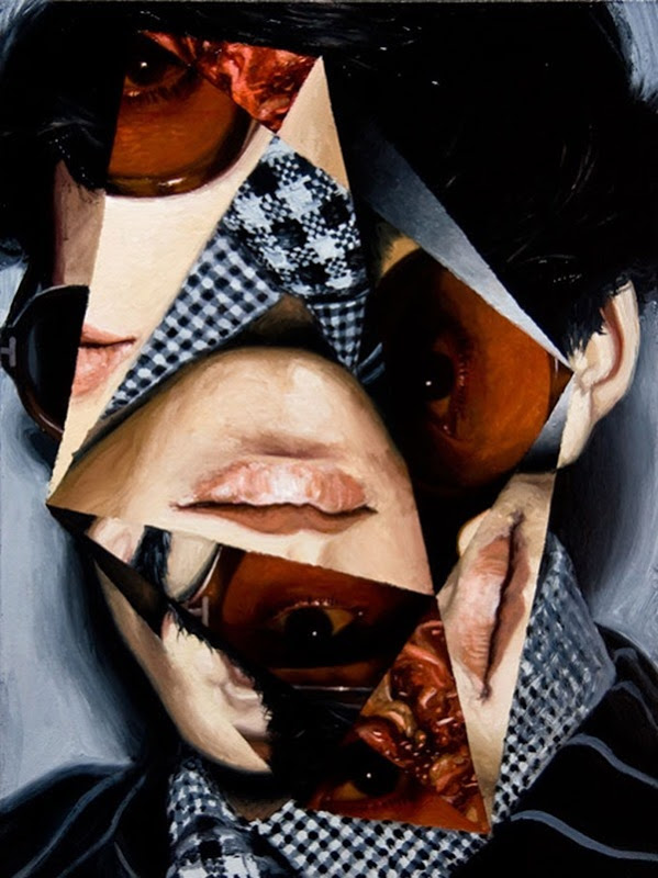
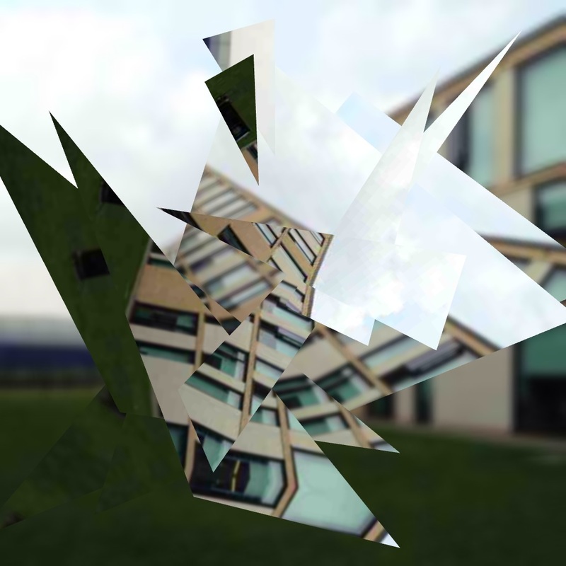
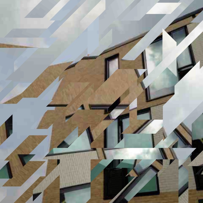
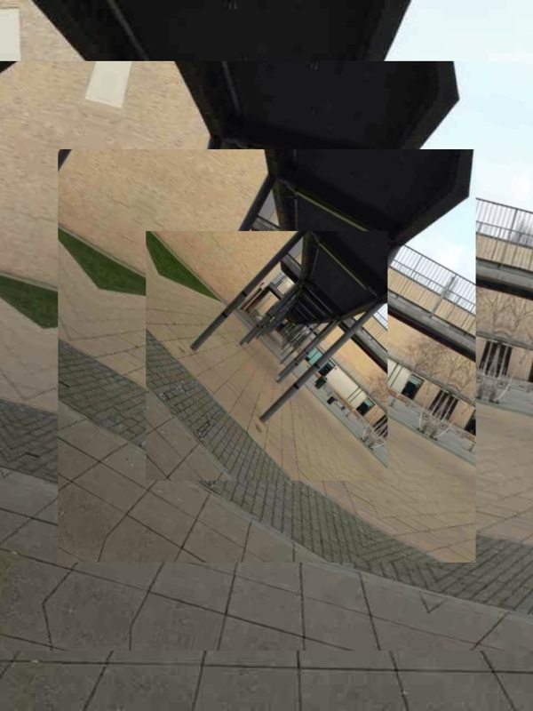
The first two images in this set are my favourites because the way I have cut and repositioned the sections of image work well and clearly show how the images has been fragmented. I think I am drawn to the first two most because even though they have been distorted they still look familiar whereas the third image is not. For the third image I attempted to make a cubist style portrait by photographing the person from three different angles but evidently it didn't turn out as well as I would have liked.
|
|
|
|
|
|
|
|
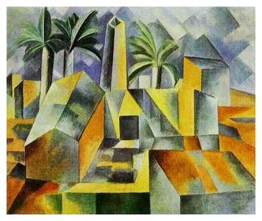
David hockneyDavid Hockney is a photographer and artist who invented the concept of 'joiners'. He did this accidentally after taking a series of polaroid images of a room and then glued them together to create the room. Later he begun to create photo collages which linked together more fluidly. His work is inspired by cubism as all the individual photos are taken at different times and perspectives. I think that cubism is one of his main influences for his joiner photography because one of his aims is to understand and explore the way human vision works and cubism does this as it shows us how what we see is processed by our brain to look realistic whereas in a normal 2D image it looks distorted and odd. His work also questions time as all of his images are fragments in time and also the way we perceive things as normally we can only see things from one angle. I attempted to make a David Hockney style joiner for my third personal project but it didn't work as well as I would have liked, so I am going to explore more ways to make a joiner image and hopefully the end product will be more successful.
|
|
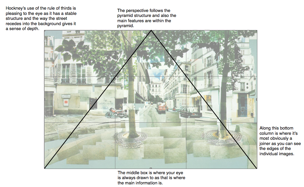
Rule of Thirds
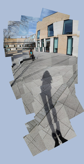
Joiner Experiment #1The image on the right is my first attempt at making a joiner. I made it using photoshop with a technique I learnt from the video below:
I think that the image has worked well because it resembles the work of David Hockney and the images blend well together. I am going to make another joiner because the idea behind them is that the image shows more than what you can naturally see whereas the one that I have made does not have that same effect.
|
|
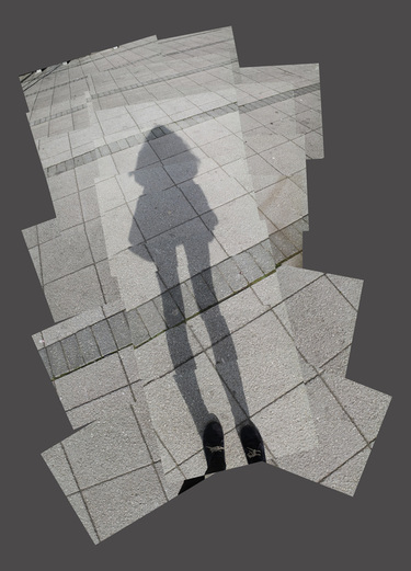
To make my second joiner I used the same process as the first (arranging them on Photoshop). This one has worked better than the last one because it shows more of the features of a Hockney style joiner as it allows the viewer to see a greater perspective of the world than they would naturally be able to. I like this image as you can see where each of the pictures joins to the next
|
This is my favourite of the joiners it has more of an illusion of depth as the perspective is central so it draws your eye in.
|
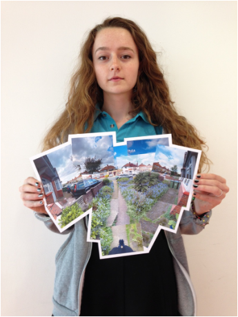
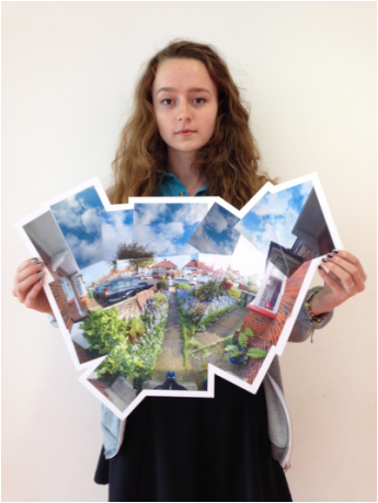
Joiner experiment #2
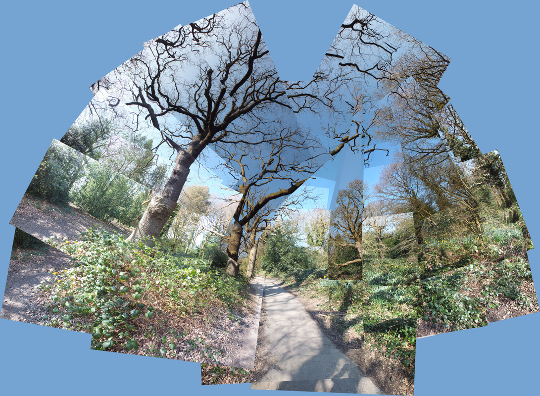
For this joiner I arranged the images myself on a piece of mount board. I made this one small as it was an experiment so each image is just less than A5. I think this image is quite successful as I like the fact that you can see the buildings on either side and you can see the houses going off into the distance. To improve it I need to take more pictures of the sky and get more building in the image.
Next I am going to take more pictures of the same spot but taking into consideration what I need to improve from this test one.
Next I am going to take more pictures of the same spot but taking into consideration what I need to improve from this test one.
|
|
Photoset: fragments
|
|
|
|
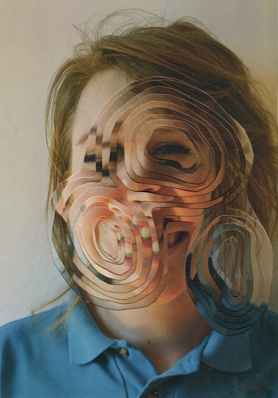
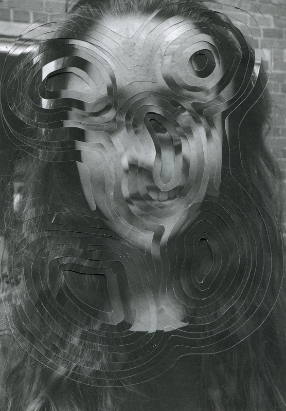
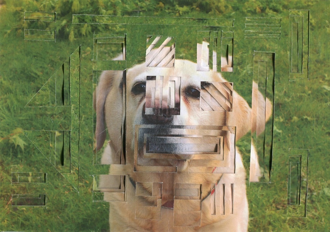
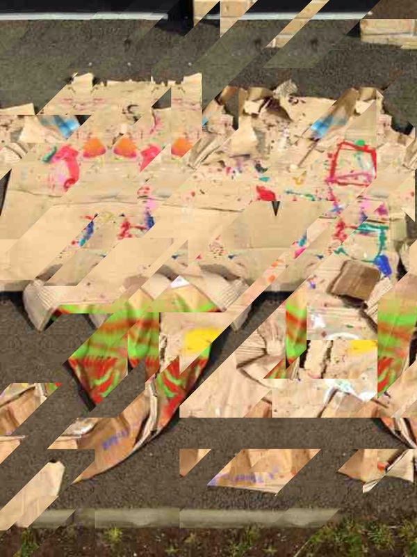
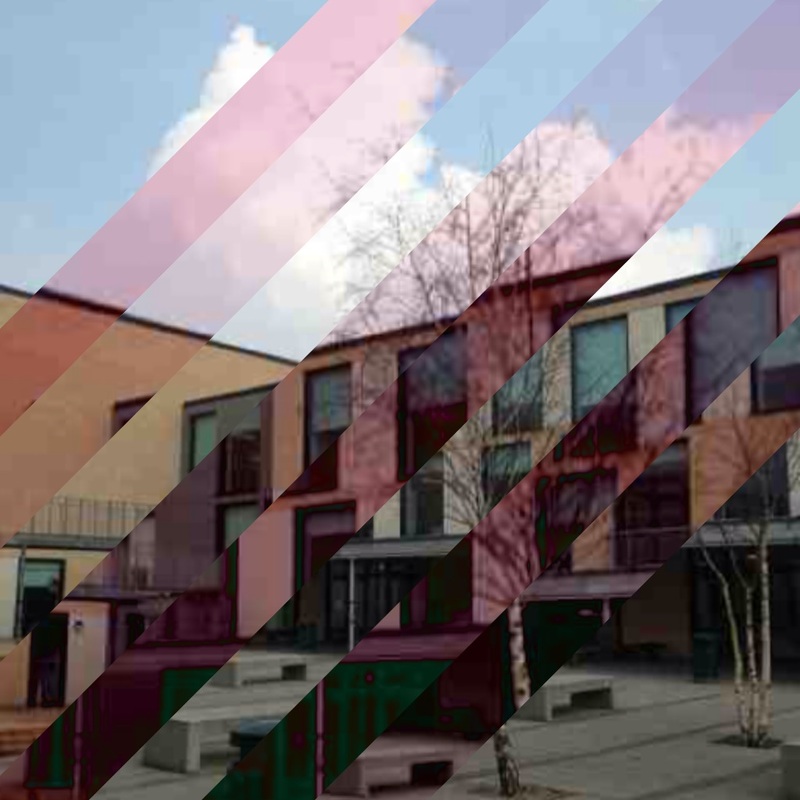
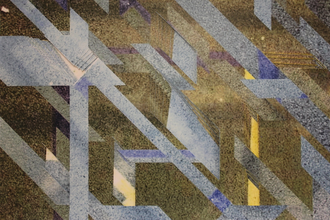
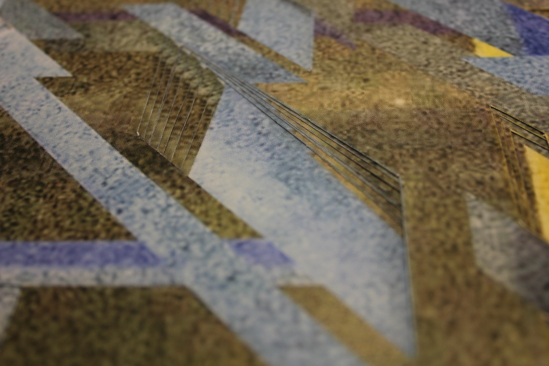
In the images above I have experimented further with Lucas Simões' technique of layering and cutting out sections of an image. Initially I was going to cut out a few sections at a time so that some were deeper than others but because the paper is thin I couldn't see the different depths. So instead I have fanned out each image so that each layer is clearly visible. I like the subtlety of the image as the way I have distorted it isn't really obvious but I think it might be a little too subtle as the original image was really crowded to begin with. I think that if I do this with a simpler image the with clean edges then it will have a better effect.
Fragments of Time
“All photographs are memento mori. To take a photograph is to participate in another person’s (or thing’s) mortality, vulnerability, mutability. Precisely by slicing out this moment and freezing it, all photographs testify to time’s relentless melt.”
Susan Sontag
|
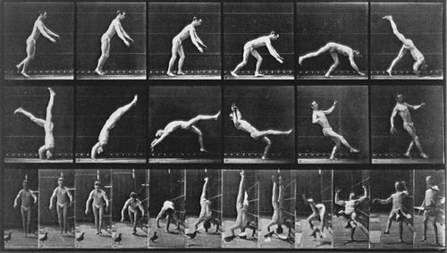
Whilst thinking about fragments as a topic I realised that photography itself is a fragment, as it captures a sliver of a landscape, an event or a moment in time. I considered the work of Muybridge as he attempted to use photography to see things for what they really were. His photography proved that photography is the only medium in which we can stop time to truly see the world around us. With each Muybridge shot the photographer, or viewer, has aged making it impossible to recreate that specific moment again. He has shown each photograph to be it's own fragment of time. |
|
